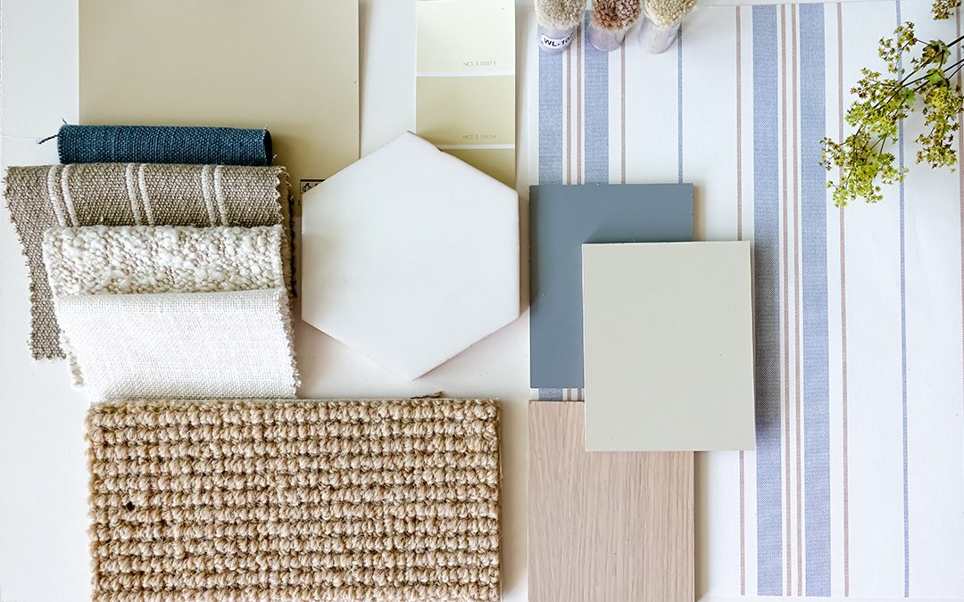
4 Mistakes to Avoid When Mixing Textures & Patterns
Mixing textures and patterns can add depth and personality to commercial interiors, but when done incorrectly, it can create visual chaos — a result no one wants!
So, if you’re looking for just the right combination of textures and patterns for a new build or a remodel of a commercial building, here’s what NOT to do…
Mistake #1: Clashing Patterns
Too many solid colors can often make a space seem dull or generic. On the other hand, too many bold patterns in one space can overwhelm the eye. That’s why, in design (as in life), we try to follow the age-old advice “everything in moderation.”
But how do you strike the right balance? Depending on the size and layout of a space, choose only one or two bold patterns that draw the eye and add visual interest, then balance the designs with softer, more muted patterns or contemporary colors. If a pattern is repeated throughout a space — on carpet tiles, for example — it will have a bolder impact, so keep that in mind as you decide how many patterns to incorporate.
Mistake #2: Ignoring Scale & Proportion
Intentional contrast is often an effective interior design strategy. Sometimes contrasting colors, textures, and materials are used to highlight architectural elements — but any interior designer worth their salt also understands that some types of contrast can hurt a design instead…
A key factor to consider here is the scale and proportion of the elements being mixed, whether it’s building materials, surface textures, or visual patterns. For instance, a large-scale texture like rough stones on a large hearth next to delicate upholstery patterns could feel disjointed.
Mistake #3: Overusing Similar Textures
You can count on texture to be a design feature that almost always requires some level of contrast. That’s because using too many similar textures can create a sense of monotony and make a space feel flat.
So, what should you do when it comes to similar textures? Layering different textures as you select interior design finishes and pieces is key in giving commercial spaces more personality. These layered textures add subtle depth and interest and, thankfully, aren’t as easy to overmix as patterns and colors can be.
Mistake #4: Mismatching Colors
Unless your intention is a monochrome design, you’ll inevitably need to select at least a few different colors and shades for your building’s palette. However, it’s important to exercise caution when mixing warm and cool color tones.
Although there’s no hard and fast rule against mixing them (it can be done effectively), warm and cool tones need intentional pairing to avoid a jarring effect.
Still not sure which tones and colors to put together? As we’ve already hinted, using contrast effectively is both a learned skill and an art — one of the many reasons it’s so helpful to have an experienced interior design team on your project!
Partner with an Expert Interior Design Team in Knoxville
The best way to avoid an unsightly mix of colors, finishes, and textiles? Consult with an experienced interior design team that specializes in commercial architecture. Their trained eye for strategic blending and balance can have an immense impact on your finished commercial design — but that’s certainly not all they do! (If you’re curious, read more about the difference between an interior designer and an interior decorator here.)
At GAEA, our team brings together licensed architects, licensed interior designers, and skilled associates in both fields. From early blueprints and big-picture ideas to final details like pillows and artwork, we collaborate closely to deliver thoughtful commercial designs inside and out.
Want to know more? Browse a wide range of our team’s work here!